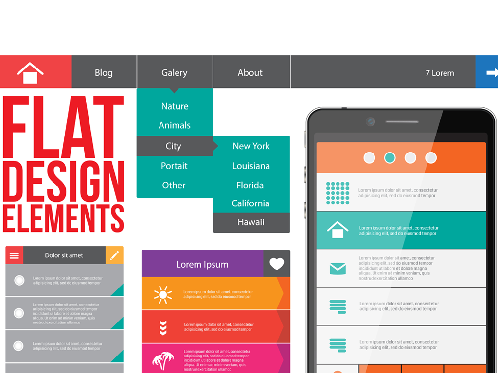
Mobile Makes the World Go Flat!
There a fresh trend that’s sweeping the web design industry called flat design. You may not have heard about it yet, but you’ve surely seen it. To be honest, it’s really not all that “new”, as Microsoft pretty much introduced it in 2006 with its now-discontinued Zune site design.
So exactly what is it that makes a “flat” web design?
Flat design is seen as simple, bright solid colors, a lot of white space, plus the absence of drop shadows, gradients, and textures that have been a major element of a web designer’s arsenal for some time now. Often typography plays a prominent role in flat web design. Flat web design is a “smooth” solution whose aim is to eliminate as many decorative elements of a “3D” type look as is feasible.
So why the change from 3D to flat design?
There are several reasons why this is taking place, but perhaps the most persuasive reason is that it’s an invention born out of necessity. The 2D environment that designers often have to work in, in this ever-more mobile world, necessitates economy of scale.
It’s become more and more difficult to cram all you may want onto a 4-inch screen, making a 3D simulation somewhat counterproductive and incompatible with a great user experience. Using a flat design pages load faster, are less bulky and are more responsive. In a very competitive world in which you have a few short seconds to make an impression on and hook your visitors, every second counts.
Is this a trend or is flat design here to stay?
It might be easy to dismiss this as merely another trend in web design, and then leave it at that, However, with the next Apple operating system iOS7 rumored to be seeking a more flat design, can the rest of the web be far behind? While it may very well turn into a fad, its simplicity and user-friendly functionality may help it to stick around longer than most.


